We’re thrilled to announce that Leadhub has undergone a significant transformation. Our rebrand reflects not just a new look, but an evolution of our mission, values and the commitment we have towards our clients in the home services industry.
The Journey From Old To New
Leadhub has always been dedicated to guiding our clients towards achieving their growth goals. Our old logo, with its vibrant array of colors and geometric triangles, symbolized the diverse and dynamic nature of our work. The negative space of the North Star in our old logo represented our role as a navigational guide, helping businesses find their true north.
Embracing Simplicity & Clarity
Our new logo is a sleek, modern "L" that retains the essence of our guiding principles. The arrow and pathing elements illustrate the journey a business takes with us, breaking through growth ceilings and achieving clarity and confidence in their strategy. The sharp arrow signifies the moment when a business realizes its potential and gains clarity on its path to success.
We've also simplified our color palette to three primary colors: Tenacious Teal, Big Wins Blue and Unrivaled Rorange. These colors not only enhance our brand's focus but also represent our core values and the emotional connection we have with our clients.
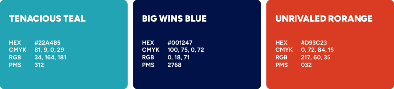
- Tenacious Teal — Symbolizes our relentless dedication and commitment to our clients' success
- Big Wins Blue — Represents the significant achievements and milestones we help our clients reach
- Unrivaled Rorange — Stands for our innovative and bold approach to problem-solving.
From Marketing Partner To Growth Partner
We’re more than just a marketing agency. Our rebrand reflects our expanded role as a "Growth Partner for the Trades." We provide solutions and tactics that impact much more than just SEO. We bring clarity and execution to the customer journey from "search to sell."
To further emphasize our role as guides, we've incorporated topographical maps into our brand resources. These maps signify the importance of knowing where you are to effectively plan where you're going. This visual element reinforces our commitment to helping our clients navigate their unique business landscapes.
We’re Looking Ahead — And The Future Is Bright!
This transformative rebrand heralds an inspiring new chapter for Leadhub — and the future has never looked brighter. Our evolved identity underscores our steadfast commitment to being the definitive pathfinders and growth catalysts, empowering the home services industry to Take The Lead.
For our clients, that means taking the lead on bold new growth strategies that leave competitors in the rear-view. For Leadhub, it means taking the lead in illuminating the optimal path forward with our unparalleled expertise. And for the industry, it signals a new era of leadership — challenging the expected and daring to blaze trails into uncharted territory.
Explore our new brand identity and prepare to Take The Lead into a future brimming with limitless potential.
The Leadhub Team