Home Services Marketing Agency
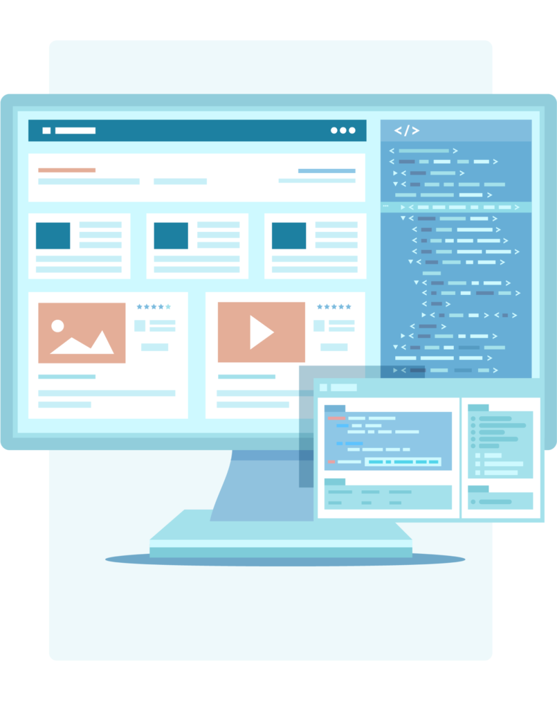
Clean, Simple, Easy To Use
The quickest way to lose potential customers is by having a slow or difficult-to-use website. There are so many competing companies in the industry, and your customers can easily switch to a site that gives them the answers they want in a timely manner. That’s why Leadhub designs websites with your audience in mind. We make sure that your site is straightforward and fast, offering your services in a sleek and search-engine-optimized design.
Easy navigation is the top feature that searchers use to qualify their experience on a website. Your menus need to make sense and lead directly to the most helpful content for your customers. Luckily, we’ve done this a time or two, and our team knows how to make your navigation logical and relevant.
Mobile-Friendly Marketing
More than 50% of website searches occur on mobile devices like phones and tablets. If your website isn’t mobile-friendly, you’re losing business right now! If customers struggle to navigate your website on their mobile devices, your entire company’s credibility can be called into question. Our team knows your audiences, and we create highly-effective websites that impress on desktops and mobile devices alike.
Secure Customer Information
It’s important to protect any personal information that your customers share with you — even just their name and email! If you’re not willing to invest in a secure site that prevents data leaks and misuse, why should your searchers trust you? Your website needs regular attention to make sure all your applications are up to date, safe and secure. Our developers are highly-experienced, giving you and your customers the peace of mind that your website’s integrity stays intact.
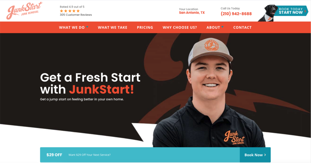
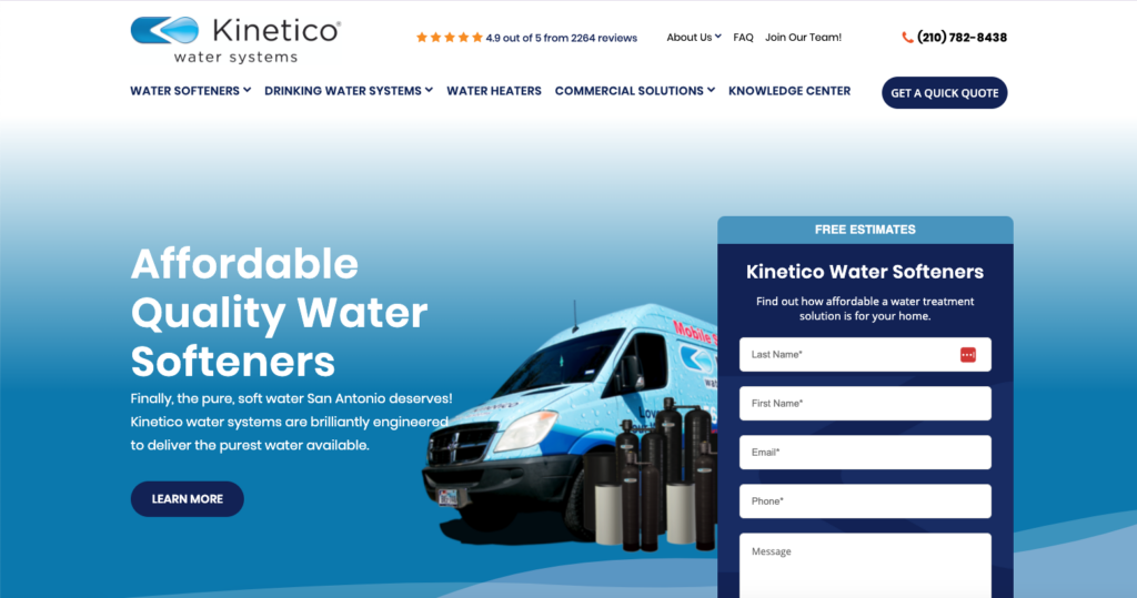
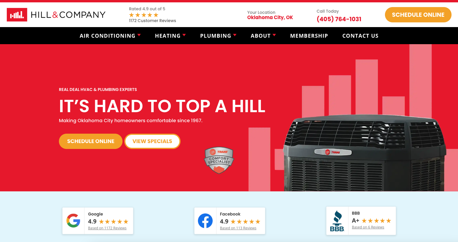
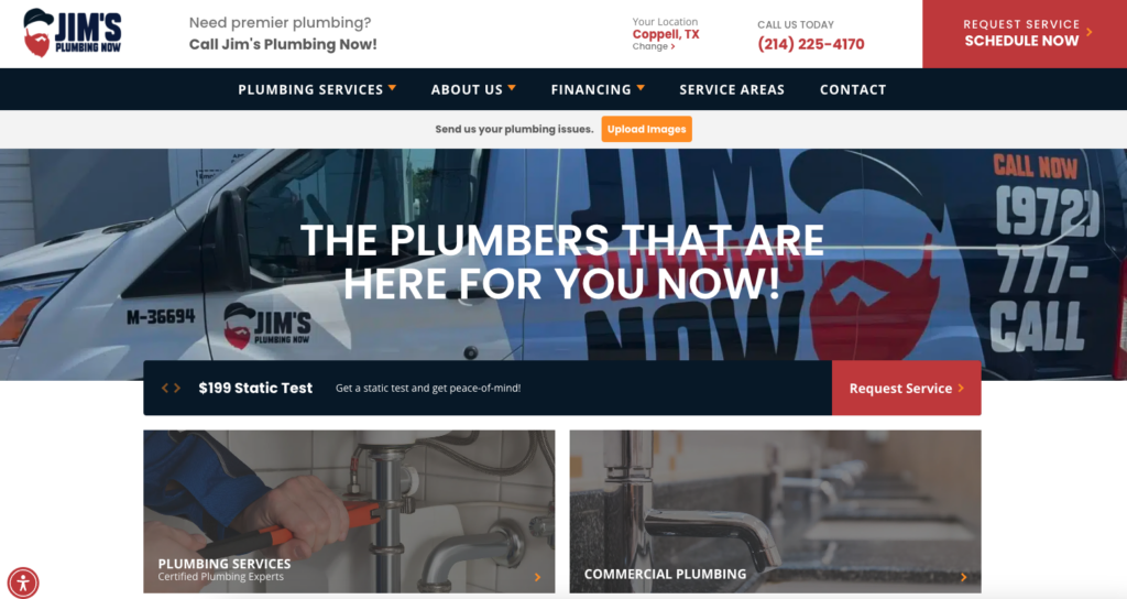
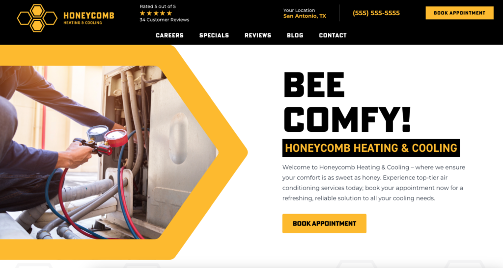
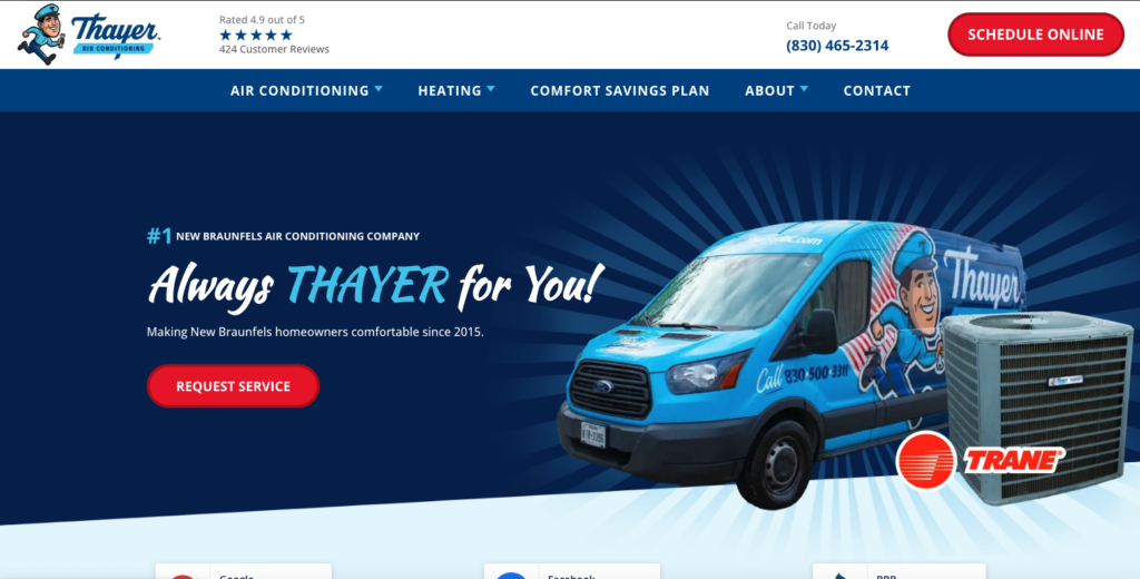
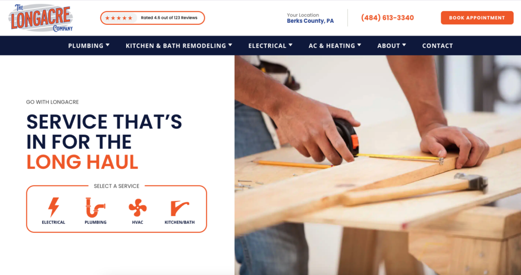
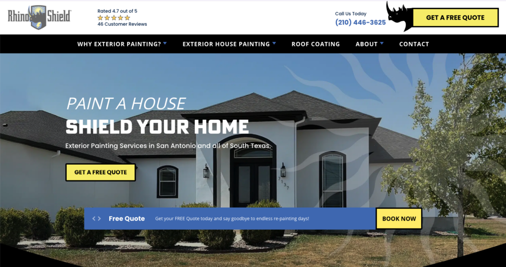
Check Out Some of Our Previous Work!


